Colour of the year 2026 for interiors: every brand's pick and how to use it
There is no single colour of the year for 2026: Pantone chose the white Cloud Dancer (PANTONE 11-4201), Sherwin-Williams a warm khaki, Benjamin Moore a dark espresso brown, while Dulux, Behr, Valspar, Tikkurila and Graham & Brown went for deep blues, greens and berry tones. In a Riga flat with grey winter light, the warm neutrals work well on large surfaces. The deep colours are best kept for an accent wall, a small room or textiles.
Author: Valerija Gelfere, interior designer · Updated
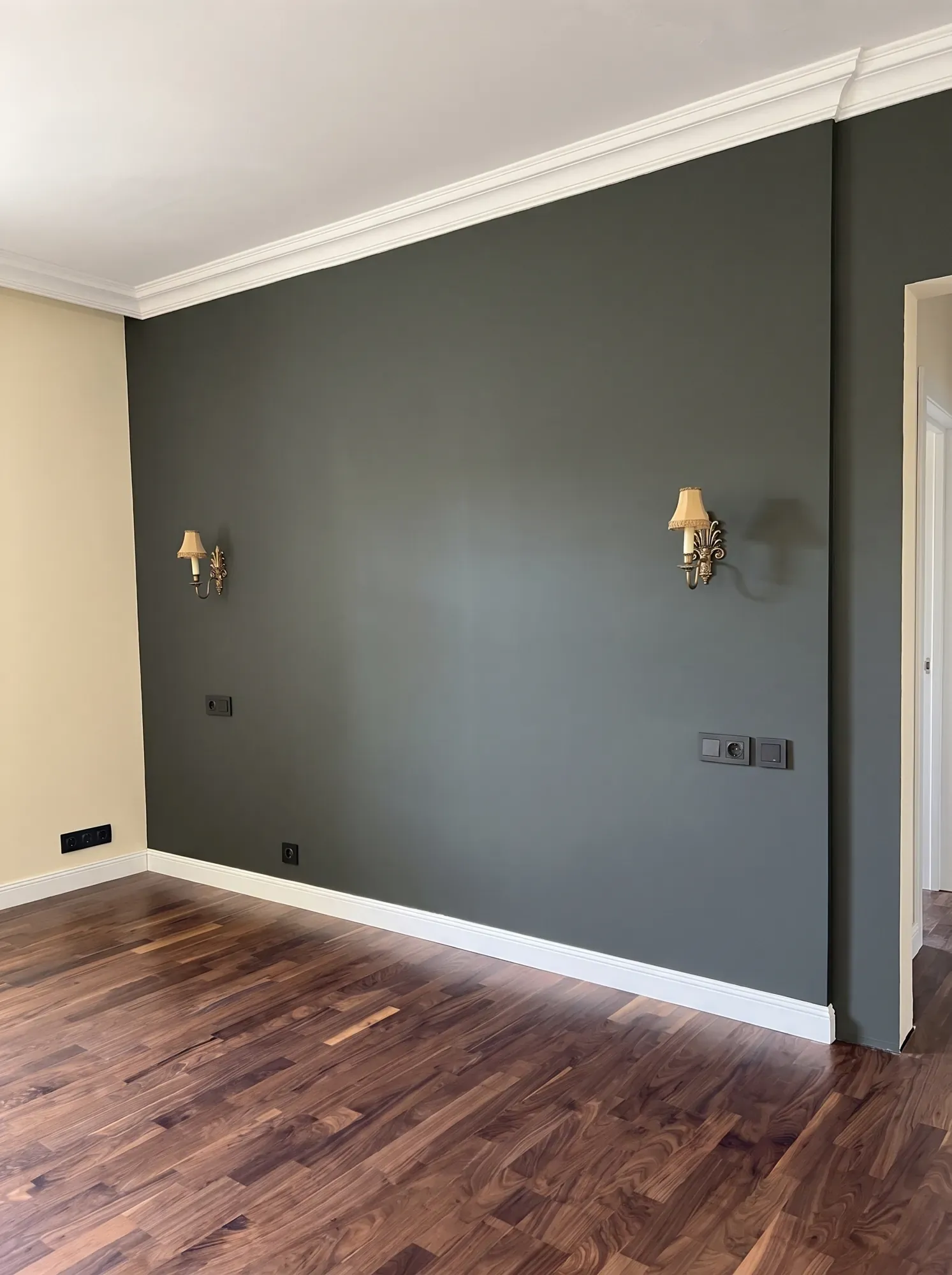
Colour of the year 2026: what Pantone and the paint brands chose
Pantone and every major paint brand name their own colour of the year, so there is no single 2026 colour. Sherwin-Williams announced its pick on 24 September 2025, Benjamin Moore on 16 October and Pantone in early December. The table gives the official names and codes, so you can find each shade in a fan deck.
Here a hex code is given only for Behr (#596D69, from Behr's page). For the others, check the maker's page or judge from a paint sample on your own wall rather than on screen: a monitor always distorts colour a little.
| Brand | Colour of the year 2026 | What it looks like |
|---|---|---|
| Pantone | Cloud Dancer, PANTONE 11-4201 | white; the first white in the programme's history since 1999 |
| Benjamin Moore | Silhouette AF-655 | deep espresso brown with a charcoal undertone |
| Sherwin-Williams | Universal Khaki SW 6150 | warm khaki beige |
| Dulux | Rhythm of Blues: Mellow Flow, Free Groove, Slow Swing | pale grey-blue, cobalt and deep blue; the first time Dulux chose a family instead of one colour |
| Tikkurila | Kameleontti L391 | multifaceted yellow-green |
| Behr | Hidden Gem N430-6A | smoky jade, #596D69 |
| Valspar | Warm Eucalyptus | calm green |
| Graham & Brown | Divine Damson | deep plum |
Two camps: warm neutrals and deep colours
Put all the colours of the year side by side and they fall into two groups.
Both groups match the wider 2026 trends. Houzz reports earthy colours replacing all-white interiors and green becoming the new neutral. Designers Dezeen spoke to talk about smoky pastels and mineral shades with one bright accent. In practice that means a calm background and one bold colour, not five at once.
- Warm neutrals and earthy tones: Pantone Cloud Dancer, Sherwin-Williams Universal Khaki, Benjamin Moore Silhouette. A background you can live with for years.
- Deep blues, greens and berry tones: Dulux Rhythm of Blues, Behr Hidden Gem, Valspar Warm Eucalyptus, Tikkurila Kameleontti, Graham & Brown Divine Damson. They give a room character, but need space and good light.
How Riga's grey winter light changes colour
In a Riga winter there is little daylight, and what there is tends to be diffuse and overcast. Under that light, cool greys turn flat and a white wall looks greyish.
It is safer to choose colours with a warm undertone: creamy white, khaki, beige, brown, greens with a yellow or brownish base. If you go for white, for example something close to Cloud Dancer, compare several white samples side by side. On the wall they differ far more than they do in the shop.
In the evening, artificial light decides the colour. Warm white at 2700–3000 K is the usual advice for living spaces, and it makes every colour warmer. So look at your sample both in daylight and in the evening under your own lamps.
Which colour works in a north-facing room
A north-facing room gets even but cool light. A warm undertone balances it, a cool one adds to the blueness.
| Room | What works | What to watch |
|---|---|---|
| North-facing room | warm neutrals: khaki, beige, creamy white, warm greens | cool greys and bluish tones look gloomy here |
| South-facing room | cooler shades too, such as the Dulux blues or jade green | in daylight the colour looks lighter than the sample |
| Small room or WC | one dark colour on every wall | the artificial lighting needs proper planning |
| Hallway without a window | a light, warm background with a darker shade on doors or wardrobes | plan the light fittings at the design stage |
| Room in a historic building with cornices | a dark accent wall with a white ceiling and cornice | keep cornices and mouldings light so the detail stays visible |
Can you paint a small room a dark colour
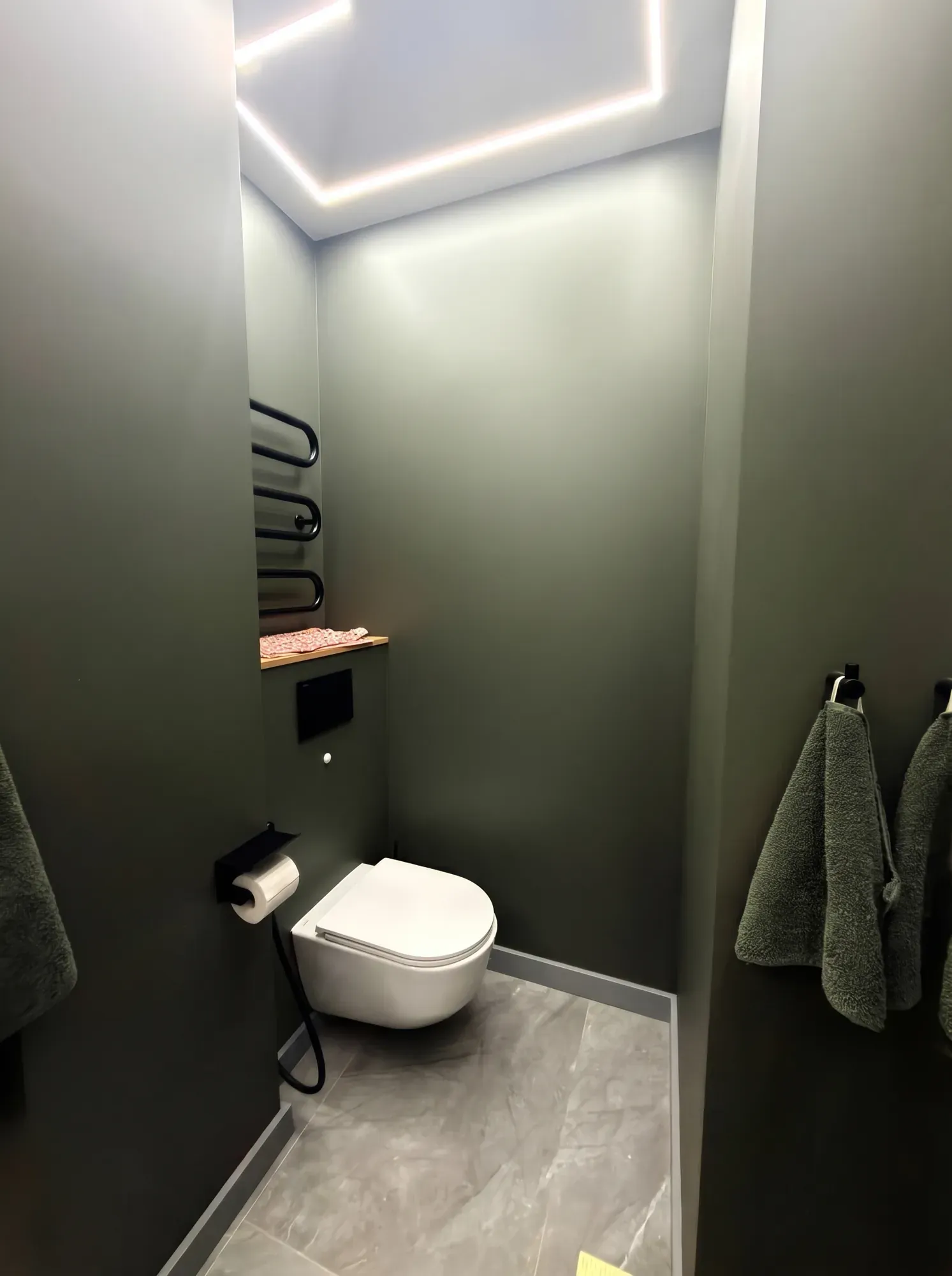
The common belief is that a small room should be white. Yet a dark colour on every wall blurs the corners, and the room stops feeling like a box.
In Soviet-era blocks the WCs and bathrooms are usually small, which is exactly where a dark colour makes sense. The photo shows a dark green WC with a recessed light line in the ceiling and a wall-hung toilet. In a dark room, even light from the ceiling helps the walls look smooth, so the room does not feel heavy. The 2026 greens, such as Behr Hidden Gem or Valspar Warm Eucalyptus, also suit a dark WC.
Accent wall or textiles: where to put a trend colour
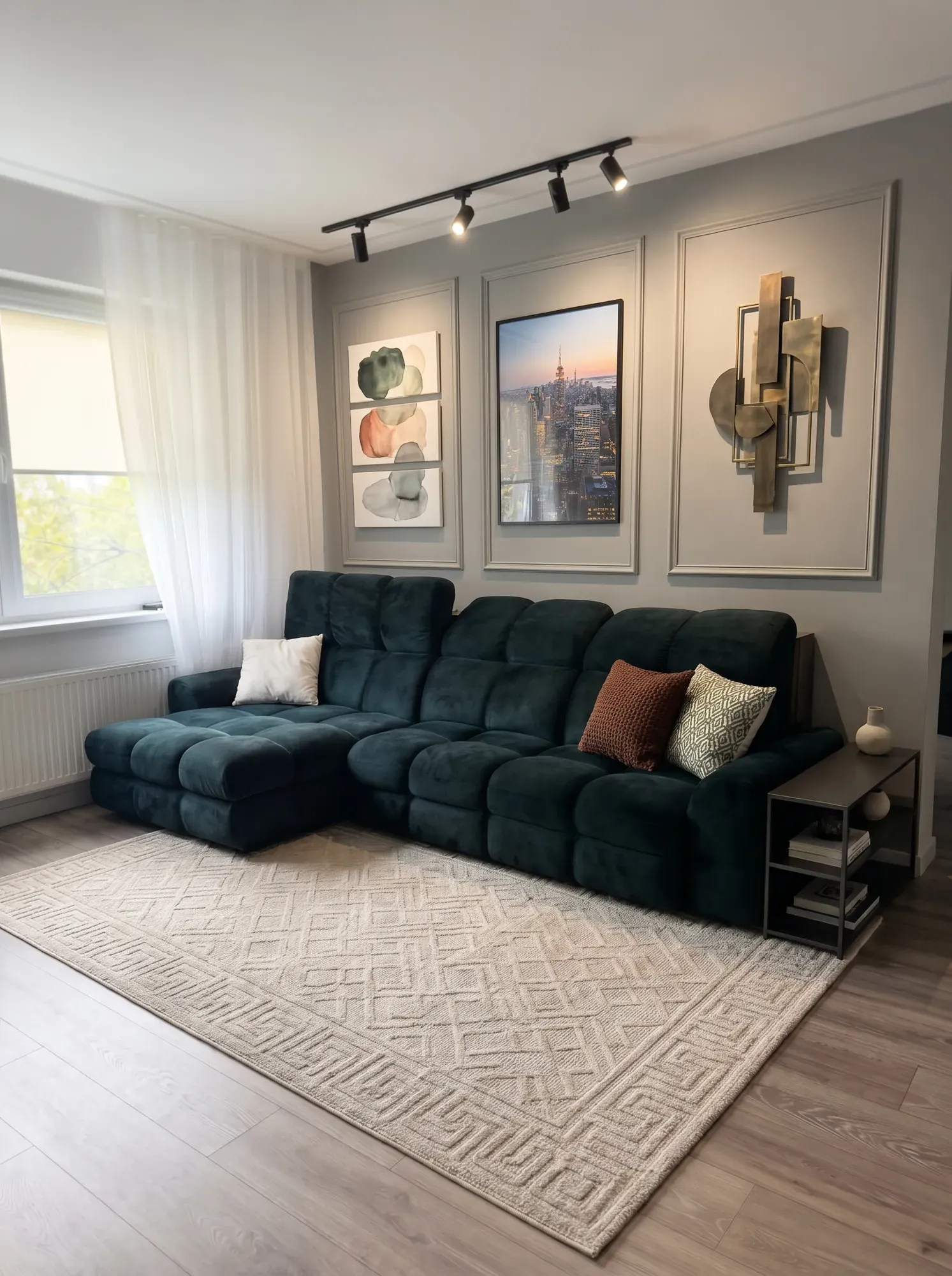
You do not have to paint every wall in the colour of the year. Kameleontti yellow-green, Divine Damson plum or Dulux cobalt work better as an accent: one wall, a sofa, curtains, cushions. Changing textiles is easier than repainting a room, so it makes sense to try the boldest colours there first. Houzz also points to warm yellow accents in textiles: ochre, mustard and honey.
The photo shows a living room with a dark green velvet sofa, track lighting and wall mouldings. A deep colour can come from furniture rather than only from the walls, and in velvet it looks even richer.
For an accent wall, pick the one you see first as you walk in, or the wall behind the bed or sofa. The window wall is a poor choice: against the light it looks almost black. Benjamin Moore Silhouette, a dark brown, suits exactly this kind of single wall, provided the others stay light.
Common mistakes when choosing interior colours
Most colour mistakes come from haste rather than taste.
- Choosing a colour from a screen or catalogue without testing a sample on your own wall.
- Using a cool grey in a north-facing room.
- Painting the whole flat in a trend colour you will tire of within a year.
- Putting several bright colours in one room instead of one accent on a calm background.
- Forgetting about evening light: under a lamp a colour looks different from daylight.
- Choosing the wall colour before the floor, furniture and curtains are decided.
Choosing colours with Valerija Gelfere
Valerija Gelfere, with more than 10 design projects completed, chooses colours together with the floor, furniture, textiles and lighting, so the flat reads as one whole. First you get a palette and a material collage, and you approve the colours from them before the 3D begins. The 3D then shows every room from all angles, all before you buy the first tin of paint.
A design project with a colour palette costs from 5 €/m². Valerija does not paint walls or carry out renovation, but she recommends painters she has worked with.
Frequently asked questions
What is the colour of the year 2026?
Pantone's colour of the year 2026 is Cloud Dancer (PANTONE 11-4201), the first white in the programme's history since 1999. Other brands chose their own: Benjamin Moore Silhouette AF-655, Sherwin-Williams Universal Khaki SW 6150, the Dulux Rhythm of Blues family and Tikkurila Kameleontti L391.
Which interior colours are on trend in 2026?
Two groups. The first is warm neutrals and earthy tones: white, khaki, dark brown. The second is deep blues, greens and berry tones, such as Dulux cobalt, Behr's jade and Graham & Brown's plum.
What is Tikkurila's colour of the year 2026?
Tikkurila's 2026 colour is L391 Kameleontti, a multifaceted yellow-green. In an interior it is easiest to use as an accent, on one wall, in textiles or in furniture, rather than on every wall of a room.
What colour should I paint a north-facing room?
A north-facing room suits colours with a warm undertone: creamy white, khaki, beige, warm greens. Cool greys and bluish tones look gloomy in such a room under Riga's winter light.
Can a small room be painted a dark colour?
Yes, especially a WC, hallway or small study. A dark colour on every wall blurs the corners, so the room stops feeling like a box. Plan the artificial lighting in advance.
Can I buy Pantone Cloud Dancer as wall paint?
Pantone is a colour-matching system, so a paint shop mixes the nearest shade from a sample. Compare several whites on your own wall, because in a Riga winter a white wall easily turns greyish.
Who can help choose colours for a flat in Riga?
Interior designer Valerija Gelfere chooses colours in a design project together with the floor, furniture and lighting. The 3D visualisation included in every package lets you see the room in different colours before the renovation.
Want these ideas in your apartment? Write to Valerija.